Looking at other film titles it is important the design matches the genre but also makes an apparent refernce to what your fillm is about e.g.

This film poster's title makes a reference to paranormal activity that occurs within the movie and also has a read colour font which makes a strong reference to the genre of the film horror.
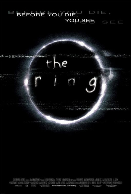
The film poster above makes a strong reference to the horror genre by the ghostly effect on the font etc. Having watched the movie I also no that the title makles a refernce to an event that occurs within the movie.
Font
Font is very important when creating a horror movie because it tells your audience what type of movie you are making. For example if you were to have a really scary image then have a bubbly type font it will make your horror appear as a comic horror. Having looked at many fonts on the website dafonts.

I have nailed it down to these ten that I am going to use.
1. 28 days later

2. Justice

4. Bleeding cowboys

5. Birth of a hero

6. Kingdom Hearts

7. cold night for alligators

8. Bloody
9. Head injuries

10. Friday 13th


No comments:
Post a Comment